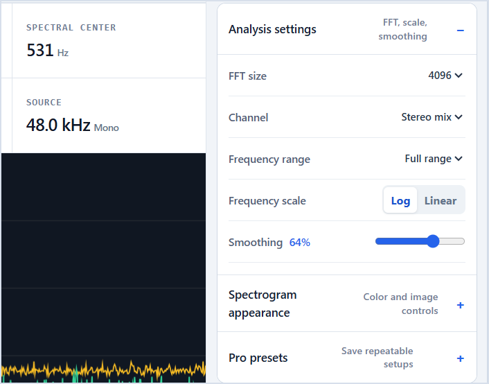
Time runs left to right, frequency runs bottom to top, and brighter color means stronger energy at that time and frequency.
A spectrogram is a history of sound
A spectrogram stacks many short frequency analyses across time. The horizontal axis is time, the vertical axis is frequency, and color or brightness represents level. Unlike a waveform, which shows air-pressure or sample amplitude, a spectrogram reveals where energy sits in the frequency range.
Read it by choosing a moment on the horizontal axis, then looking vertically to see the frequencies present at that moment. Follow a frequency horizontally to see how long it lasts. This simple two-direction method makes dense images much easier to understand.
- 01
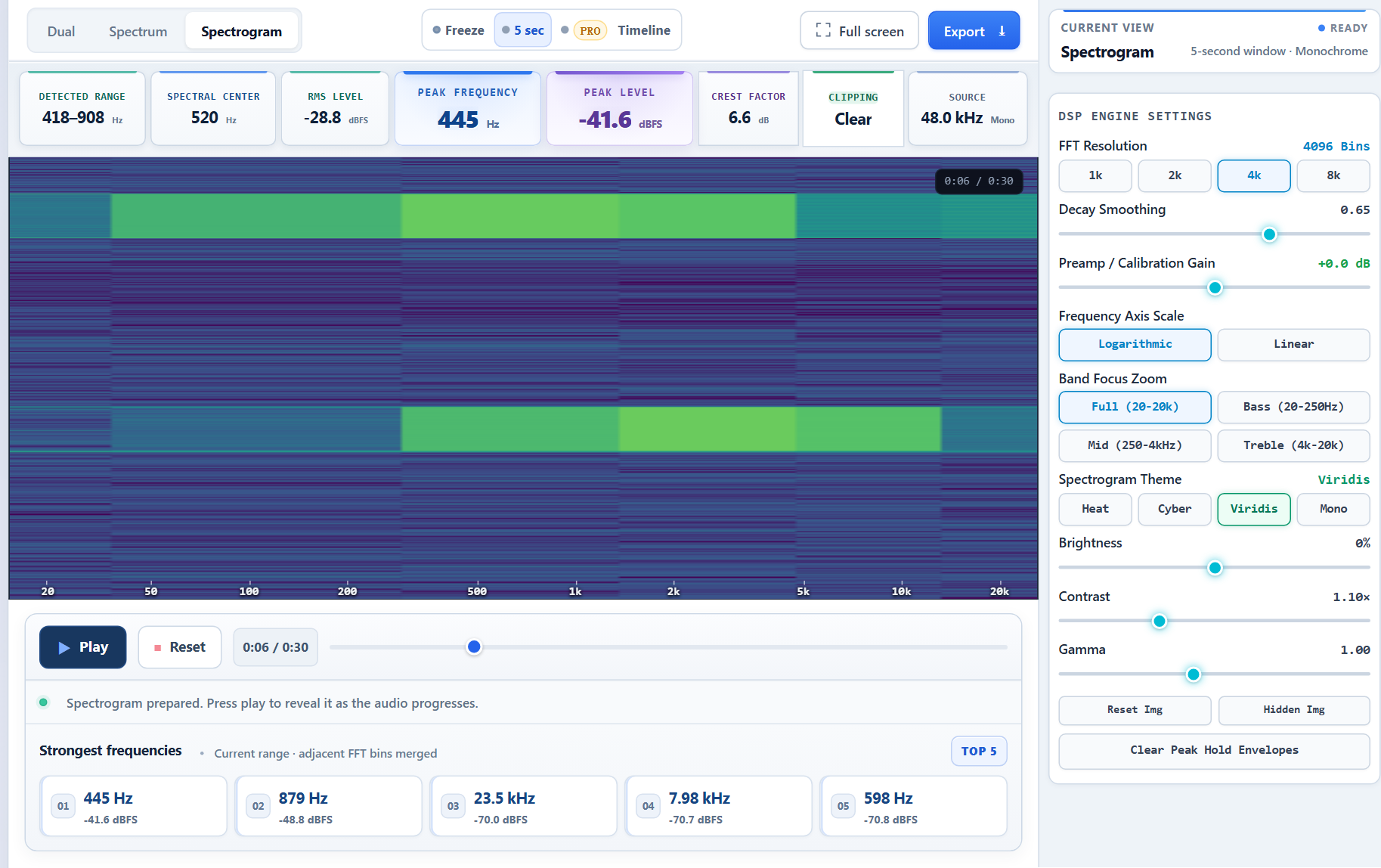
Load and play the source
Choose a file with a clearly identifiable event so the visual pattern can be checked by listening.

- 02
Switch to Spectrogram
Select the Spectrogram tab to replace the momentary curve with a time-frequency history.

- 03
Read time and frequency from the axes
Follow time from left to right and frequency from bottom to top; brighter regions carry stronger energy.
- 04
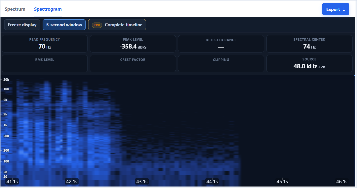
Adjust resolution only when needed
Change FFT size or frequency range for the question being investigated, then compare the same passage again.
Recognize common shapes
A steady sine wave becomes a thin horizontal line. Harmonic sounds produce several parallel horizontal lines. A rising whistle or engine acceleration draws an upward curve. A click or drum transient creates a narrow vertical mark because it contains a wide range of frequencies for a short time.
Broad fuzzy regions usually indicate noise or highly complex sound. Speech combines horizontal harmonic bands with changing resonances called formants. Music mixes sustained harmonic lines, vertical percussion, and textured high-frequency energy.
- Horizontal line: stable frequency.
- Parallel lines: harmonic series.
- Diagonal curve: changing pitch or sweep.
- Vertical stripe: transient or edit click.
- Cloud-like region: noise or dense texture.
Tune contrast before drawing conclusions
Brightness controls how much low-level detail becomes visible. Contrast separates strong features from the background. Gamma changes how middle intensities are distributed. Raise detail gradually: an aggressive setting can turn codec noise into apparently meaningful shapes.
Color maps do not change the analysis data. They change how your eyes separate levels. A high-contrast monochrome map is useful for hidden images and fine edges; a perceptual color map is often easier for everyday audio.
Match resolution to the question
A larger FFT window improves frequency separation, producing thinner horizontal lines, but spreads short events over more time. A smaller FFT window sharpens timing but merges close frequencies. There is no universally best setting.
For speech and percussion, start near 2048. For general music, 4096 is balanced. For stable tones, tuning work, or hidden spectrogram images, try 8192 and compare. Exporting the current five-second window is useful for sharing a close inspection; a full export is better for locating structure across an entire file.
Common questions
What do brighter colors mean?
They represent stronger signal energy according to the selected color map and display settings. Brightness is relative unless the legend is calibrated.
Why does silence still show texture?
Microphone self-noise, room noise, codec artifacts, and the display contrast can remain visible even when no intentional sound is present.
Can a spectrogram identify a sound automatically?
It can reveal patterns that help identification, but visual similarity alone is not proof. Context, listening, and repeatable measurements still matter.
See the frequencies for yourself.
Upload a file, use the microphone, freeze any moment, and export the result.
Analyze audio